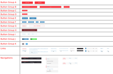
One important Decidim’s accessibility criteria violation concerns the navigational and functional link and button styling.
In the attached screenshot I've gathered visually similar buttons into their own groups found on Metadecidim. The main problem is that we have at least 11 groups of different styles of buttons for a single application.
According the the accessability experts, we should have the following styles for buttons:
- Primary (e.g. Group A)
- Secondary (e.g. Group G)
Makes the UI clearer and more understandable as the user gets accustomed to the two simple styles of buttons. Other one can be one can be functional, e.g. publish a proposal (primary) and the other navigational switching from one view to another (secondary).
Regarding the links, the accessibility experts suggest that:
- All links should have the same styling
- Links should not appear in grey color unless they are disabled


Compartir
O copiar el enlace