Propose new functionalities for Decidim software
#DecidimRoadmap Designing Decidim together
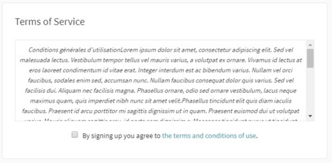
To improve the Terms of Service (TOS) block in the sign up
Hi everyone,
We think the TOS block should be a lot more appealing and understandable for the user.
We want to improve the transparency of that kind of text, but the fact that this block doesn't take into account the headings and the formatting of the text is making the TOS really hard to read.
We'd like this block to be a lot more readable for users (by accepting the different headings and formatting).
List of Endorsements
and 2 more people
(see more)
(see less)
Report inappropriate content
Is this content inappropriate?
2 comments
Conversation with Pau Parals
Good proposal @pops,
In fact, a client has told us that the fact that a user has to scroll to see all the TOS is not too "law-friendly." We had to overwrite a table with the information that give to us. I do not know if that is true.
Maybe @arnau, @andres or @carol have more info.
I agree @Pops, we should definitely make it more legible.
Regarding your question @paarals, I'm not sure, but I would say that the fact that scrolling is mandatory is more in accordance with the law than the opposite. For example, haven't you found that in some websites when they update their terms and conditions they force you to scroll to the end to consider that you have read the full text?
But as @andres would say, IANAL 😂, so maybe someone else can give us a hint about this.
Add your comment
Sign in with your account or sign up to add your comment.
Loading comments ...