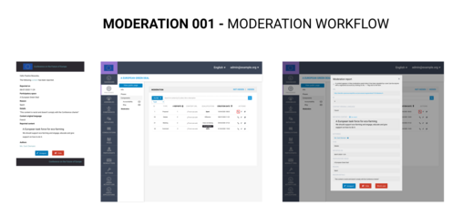
Improve UX of the Notification System and Moderation Workflow
**Is your feature request related to a problem? Please describe.**
Currently the moderation system is not friendly in term of AX (Administrator user experience). Moderators receive an email which provide them with a link to a table showing all reported content. In the table the content of the contribution is not displayed, so the admin has really hard time finding what button to click if any action is needed, especially when there are a lot of them.
**Describe the solution you'd like**
We'd like to enhance the AX for moderators by implementing the following enhancements
In the notifications
- Add action buttons directly inside the moderation notification email (that provide more info since this PR) so that the moderator can unreport or hide the content from the email without having to go into the moderation panel
In the moderation panel
- Change column titles and order to be more self explanatory
- Add date creation to know what to moderate first
- Add ordering capability to creation date and number of reports column
- Add filtering capabilities by type of content (proposal, comment, meetings)
- Add a search bar (scope : title, description, author)
- Add a modal that allow the moderator to see all the reported content info inside the admin
**Describe alternatives you've considered**
Nope
**Additional context**
Nope
**Does this issue could impact on users private data?**
Nope
**Funded by**
EU Commission


Share
Or copy link