.png)


Visualizing the summary of a process

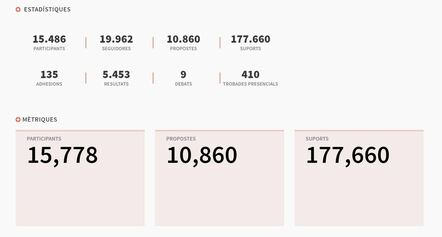
The objective of the tab “Què és” (example) is to inform about the specific process and how the citizens participate in the open assembly. We think that an important improvement can be done on the graphics because the concepts shown are often not explained, which hinders their interpretation.
We propose the next improvements:
- Graphics on Metrics: We think that it is more relevant to inform about the thematics that are more popular or less discussed, rather than the temporal information about participation on the platform. A bar plot with different thematics on X axis and the number of participants on Y axis could be a good alternative. In case there was a bar way larger than the rest, we could solve it by adding dynamic filters or tuning the y-axis.
- Information clarification on Statistics: The addition of a tooltip to explain what is plotted on each graph. For example, what does “resultats” mean?
Previous reference: https://github.com/decidim/decidim/issues/3398
We hope you find this proposal interesting. We would love to further discuss it!
QR Code

Visualizing the summary of a process
Liked by


Share
Or copy link