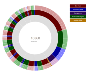
Visualization about the submitted proposals
We would like to discuss some suggestions with the aim of improving the usability of the visualizations of a closed process, like the ones of the PAM 2016-2019. In particular, we place our focus on the visualization that aims at outlining the proposals submitted (attached - it can also be found in tab Visualizations > Proposals). We think that it would be relevant that the given visualization helps us, as citizens, to understand the hot topics discussed in the given process at first glance. Besides, the current visualization already appears in another tab (Summary > number of proposals), making it redundant.
The current visualization is focused on the pre-set thematic axis of the given process. However, we believe that taking into consideration a smaller granularity of the proposals, such as the most-used words in the proposals’ titles, could enrich this tab by bringing to light the topics that citizens are most concerned about.
For this purpose, a word cloud could be used. Ideally, filters such as the neighbourhood, thematic axis, and proposal category should be available to apply. And, to put the cherry on the cake, each word could have a hyperlink that links the given word to the set of proposals that it represents.
To sum up, we suggest changing the current visualization for a word cloud based on the titles of the proposals submitted. With this proposal we hope citizens would better understand the content of the proposals presented.
We would like to get to know your opinion to discuss this proposal.


Share
Or copy link