.png)


Show results in the first page of the accountability component and other UX tweaks

Problems
- When there are no categories/subcategories defined, the respective columns are displayed blank. This is confusing to the user (it looks like nothing else is there) and requires an extra click to navigate to the list of results or may even prevent access to the results
- The list of results is not visual and may discourage reading for some user profiles.
- Some results are related to physical places but there is no way to define an address for a result, in order to display a map with the results. As now you can do for the proposals
- Now it is not easy to know with a quick view how many results are pending, working or completed, eg.
Solution proposed (modified)
- Show always the results list in the first page below categories/subcategories block (only visible if any are defined).
- Show an image in the results list (if any is defined as attachment or image field), like actually is shown for proposals or PB projects.
- Add an address field and the option to activate a map in component settings.
- Add a filter & counter in the sidebar to show how many results have each state, if any is defined. User can click one to filter to one or more states.
Describe alternatives you've considered
Resolve only some of these problems. The most critical is the first.
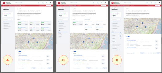
Screenshots
See above.
- A) When only categories are defined
- B) When categories & subcategories are defined
- C) When no categories are defined
Does this issue could impact on users private data?
No
Funded by
We have some customers who can finance these improvements.
QR Code

Show results in the first page of the accountability component and other UX tweaks
Liked by


Share
Or copy link