Propose new functionalities for Decidim software
#DecidimRoadmap Designing Decidim together
Vote multiple times for a same project
UPDATED ON APRIL 8, 2021
Is your feature request related to a problem? Please describe.
With the actual voting systems on participatory budgets, users can vote according to a percentage of the total budget, or with a min or max of projects to be voted on. The problem is that they can't express any preference for a specific project by granting it several votes.
As a user voting in participatory budget process, I want to express different levels of support to the projects I'm voting for.
As an admin I might want to implement rules to register that information and adapt my vote tally accordingly.
Describe the solution you'd like
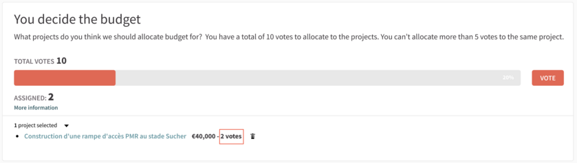
Admin side (see mockup)
The creation of a new voting rule taking as input 2 parameters :
- The total number of votes available to each user;
- The maximum number of votes that can be allocated to each project;
This new voting rule is not compatible with the current existing rules.
It will be necessary to remove the check that blocks the selection of a project several times by the user to develop this functionality.
User side
This is where the complexity in term of UX of the implementation lies.
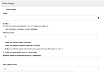
We set some preliminary constraints upstream:
- The interface must work on any type of device;
- The interface must be accessible (RGAA);
- The interface must adapt to different values set in the parameters of the rules;
- e.g.: if the number of votes authorised per project is set to 10 or 20, it shoudn't be a problem for the interface.
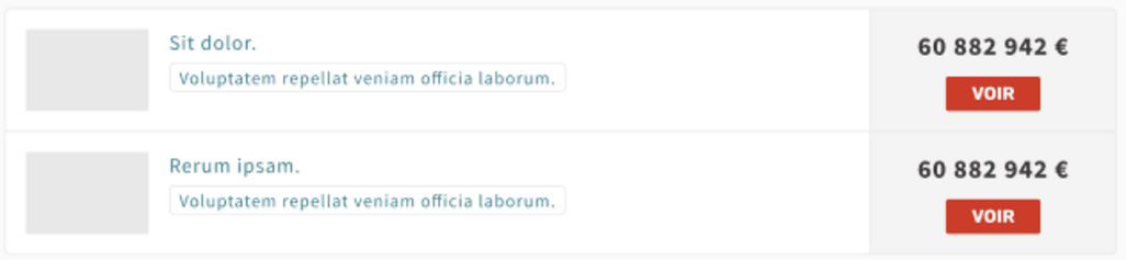
The project index
In addition, the Decidim product team has decided to simplify the interface for the proposals cards, vote buttons will no longer be displayed on the cards to reduce the amount of info shown to users.
This applies to budget project, we plan to anticipate this evolution as part of the development of this functionality. See mockup for projects index.
The voting interface
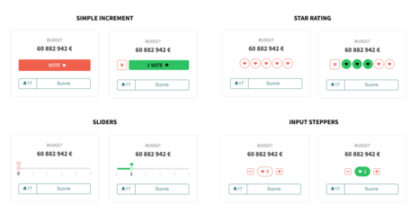
We investigated 4 types of interfaces for this user interaction :
- Incremental vote buttons
- Input steppers
- Star ratings
- Sliders
See the mockups attached. Our team is in favour of implementing the input steppers as
- they scale well if many votes can be given to a single project,
- the increase / decrease vote allocation interaction is clear for user
- the budget order is built like an e-commerce order, input steppers are widely used to set quantities
Does this issue could impact on users private data?
No
Related links
Token voting rule on Budget component (External link) (withdrawn)
Provide new option to support a proposal: with a scale (External link)
A study conducted by Toulouse about voting methods on participatory budgeting (External link) (in french)
Funded by
Toulouse
List of Endorsements
Report inappropriate content
Is this content inappropriate?
18 comments
Conversation with Pauline Bessoles
@ahu @carol @paarals @andres @furilo do you have any insights?
maybe quadratic voting is an option https://en.wikipedia.org/wiki/Quadratic_voting. did you think about it?
This is a different feature that I'm dying for to exist.
Once the feature described in the proposal we'll be one step closer to implement quadratic voting in Decidim.
This is great @Pops for re-introducing this proposal!
For the questions:
- I'd keep the voting button.
- I'd keep the "cost" of each vote the same. Quadratic voting is another topic and separate to this particular issue.
- I think this should be compatible with all voting rules. With budget based voting each vote would just accumulate the project's cost to the total budget.
How the user would pick the same project multiple times: IMO, they would just click the vote button multiple times and that would accumulate the same project to the total budget every time it is added. There would be some number or icon shown close to the button how many times it has been added.
If they want to remove it, they need to remove all votes from that project and start again.
This would be probably good to iterate this through with a UI designer through a couple of iterations and test it with real people. The voting feature is already complicated to many people, so KISS.
Small clarification:
I mean they could still remove one project from their vote but removing that project would remove all the votes for that project.
Thanks a lot for your answer Antti! I agree, this should be tested with real users in some way.
I made a new mockup integrating your feedbacks : https://imgur.com/nLZkCzG What do you think?
In order to add a graphic visualization to let the user know where she's at with her votes, I added a button "fade": the button would become more opaque the more you give the projects votes.
In this mockup, this feature is used with the Min&max number of projects feature, which allows you to vote between 1 and 6 projects -> you have 6 votes. The wording should be changed (projects->votes).
Thanks a lot @Pops - This looks already really good to me.
Regarding the opaqueness, I think this might be an accessibility problem. I'd prefer some other way of indicating how much the user has voted on a single project. Either show the exact number or some kind of icons/indicators to show how many votes you've given to the single project.
Not so fancy as your mockups but here's also some quick ideas to demonstrate what I proposed above.
Budget based voting:
https://www.figma.com/proto/oIOhQQYYb4dYs3yez5JMbi/Decidim-Weighted-Voting?node-id=1%3A2&scaling=min-zoom
Project based voting:
https://www.figma.com/proto/oIOhQQYYb4dYs3yez5JMbi/Decidim-Weighted-Voting?node-id=4%3A63&scaling=min-zoom
We've also seen in actual use that the checkbox icon for the selection seem to be problematic for many users. They think clicking the checkbox is enough and they don't click the "Vote" button at the end. It's not particularly related to this issue but I think having the text "add to vote" in the button might help understanding that clicking the button in the project is not enough.
@ahu I find your proposal really clear and easy to navigate. @pops what do you think ?
I also think it's the most usable proposal for the accessibility reasons Antti is raising!
I'd also like to have @carol feedbacks about this, but this already seems very good @virgile_deville
I don't have many experiences with budget voting, so take my words with perspective. Some general comments:
In the attachment you share, am I seeing my votes or everyone's votes? (I don't know if everybody's votes should be shown at this stage, maybe not)
(...continue ->)
An element that I think would need to be defined is the counter of votes you have left, which should be present at all times (but alas, I would need to understand the complete flow of how the voting would occur)
Anyhow, yet more questions than answers ;)
Thanks for your feedbacks álvaro!
I agree, the total of votes you have left should stay below the progress bar (may be make it sticky would allow it to be visible at any time).
About showing total votes, I also think it can be confusing, but this is already a config flag in Budgets step settings, so the admin could decide if it's appropriate in her user case.
Regarding the number of votes for a specific project, I also think that a limit should be established (it doesn't make sense to be able to vote more than 10 or 15 times for a same project). But I think that putting a mandatory number for admins won't answer to every use case. I like the idea of the scale on the project page, but the main problem is to make it fit in the projects list cards.
In the mockup I published in my answer to Antti, may be I should add in the projects selection the number of votes allocated to the projects (at the left of the bin icon?).
Anyway, thanks again for your feedbacks!
Conversation with Pauline Bessoles
Hi to all following this proposal!
I made a second iteration of what this feature would look like in BE and in FE (on the projects index).
You can find the mockup here: https://www.figma.com/proto/SjLsHxOSVsNUn71d1PQpn9/Metadecidim?node-id=8%3A176&viewport=703%2C436%2C0.10763725638389587&scaling=scale-down-width
The idea here is to create a new separated voting rule, that wouldn't be compatible with the others.
@ahu After iterating on the eventuality of making this feature compatible with all the voting rules, I'm afraid that would be really confusing, for the admin and for the users. Tell me if you want me to post them here!
Looks really good to me @Pauline !
One thing I'd like to add would be a button/link to remove the project from the vote next to the project controls on the right side. I guess it could be also just an [X] button at the top corner with a screen reader label attached to it.
It would be also good to think how this will align on mobile. Especially among the youth, mobile usage is around 70-80% of the users and the budget voting view we have right now is not very understandable on mobile.
I understand the complexity related making it compatible with the budget based voting. I haven't heard of such request yet, so I think it's probably OK making it a separate rule.
Thanks for your feedbacks, I forgot to add the remove button! I added it in the previous mockup, tell me if you think that's understandable for the user.
You can find the mobile mockup here : https://www.figma.com/proto/SjLsHxOSVsNUn71d1PQpn9/Metadecidim?node-id=47%3A981&viewport=510%2C436%2C0.1859215945005417&scaling=min-zoom
Yes, remove button works well. 👍 I'd make it slightly larger, though.
Regarding the mobile, I'd like the buttons to be much bigger. Now they go very small after one project is selected.
Apple suggests mobile touch targets of at least 44x44px and Android suggests minimum of 48x48dp (dp = visible pixel).
https://developer.apple.com/design/human-interface-guidelines/ios/visual-design/adaptivity-and-layout/
https://material.io/guidelines/components/buttons.html#buttons-style
Apple's recommendation is also a WCAG success criteria:
https://www.w3.org/WAI/WCAG21/Understanding/target-size.html
Some external feedback: https://twitter.com/IdeaRatingGuy/status/1363898928006127623
https://en.wikipedia.org/wiki/Score_voting
Add your comment
Sign in with your account or sign up to add your comment.
Loading comments ...