.png)


Design considerations for people with dyslexia
Is your feature request related to a problem? Please describe.
Pierre Mesure connected some student groups at the Hyper Island career institute for researching Decidim accessibility. We sent them the prototype for the redesign and they worked on that.
One of the teams focused on design considerations for people with dyslexia and they came up with the following design suggestions that would make the platform more understandable for dyslectic people:
https://www.figma.com/file/qb1qzhCGTdfzxlNq6lfWv0/Team-5-UX?node-id=161%3A110
The design choices were based on in-depth interviews with people with dyslexia.
This proposal is meant to document these for future development consideration regarding the Decidim design. We understand that these are not necessarily something that can be implemented to the first version of the redesign.
Describe the solution you'd like
There were several suggestions that would make the platform more accessible for dyslectic people. The suggestions are documented into the following subsections. I will also add these suggestions as images attached to the proposal.
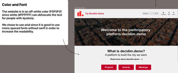
1. Color and font
The website in the prototype is in an off-white color (#F0F0F0) since white (#FFFFFF) can obfuscate the text for people with dyslexia.
The font selection, the design team used Arial as it improves readability.
Additional note from Lucien Langton was that Arial is not mono spaced font as the design team said. Extra comments from Lucien regarding the font selection:
- It is good thing the design team did not use a mono spaced font because it's harder to read for everybody else (than dyslectic people)
- Sans serif choice is great, however while staying as accessible for dyslexic users he would recommend using Inter sans for aesthetic reasons
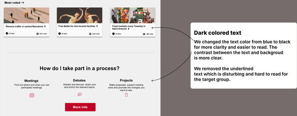
2. Dark colored text
The design team decided to change the text color in the cards from blue to black for more clarity and to make it easier to read. This way the contrast between the text and background is clearer.
With this change, the design team also removed the text underline which can be disturbing and hard to read for dyslectic people.
To add an extra note here that there are accessibility criteria that requires links to be distinguishable from the rest of the text either using an underline below the link or a clearly distinguishable color (according to the WCAG color contrast requirements) which was not considered by the team producing these suggestions. The means that this design choice needs to be carefully examined in order to make it in line with the WCAG requirements.
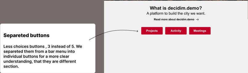
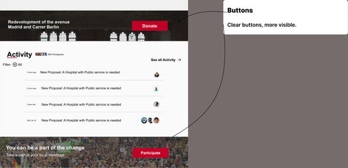
3. Separated buttons
The original redesign provides the Decidim default menu option under the introduction section on the home page of the platform. This can be problematic for people with dyslexia as it has many options to choose from and the different menu items are not clearly distinquishable from each other.
The design team decided to make the links buttons to make them more distinguishable and also to limit the number of options to 3 instead of 5 as in the original Decidim redesign.
4. Button design
The button design should be clear and distinguishable from the rest of the contents. As a general rule, buttons should look like buttons.
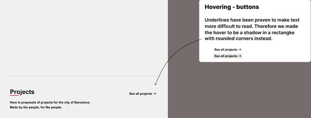
5. Hovering - buttons/links
Underlines with links have been proven to make text more difficult to read. Therefore, the design team changed the underline effect to a shadow effect in a rectangle with rounded corners instead. This makes the effect more distinguishable for dyslectic people.
Also to add an extra note here that the WCAG requirements about distinguishable links (color or emphasis, e.g. underline) should be considered with this design suggestion.
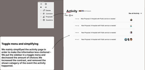
6. Toggle menu and simplification
The activity section has been simplified by the design team to make it less cluttered. The filtering options were also hidden under a toggle menu to decrease the amount of options visible on the screen and the amount of choices that the users can make.
The text contrast has been also increased here and the "category" of the event to make the visible information more understandable.
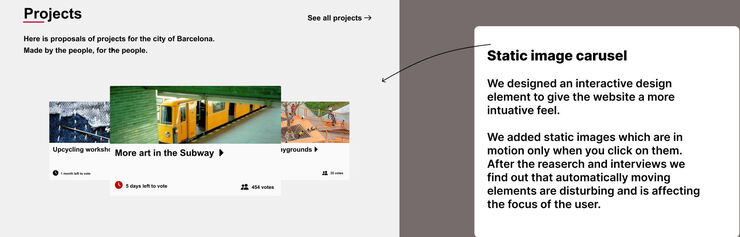
7. Static image carousel
The design team added an interactive carousel element to the home page to give the website more intuative feel.
The images in the carousel are static and move only when the user clicks on them. The research showed that automatically moving elements are disturbing and can affect the focus of the user. As an extra note, WCAG criteria does not necessarily prevent having automatically moving elements but in case there are such elements, the user should be provided with play/pause options to stop the movement in case they want to.
8. Larger map
The map size has been increased to make it clearer and easier to read and understand.
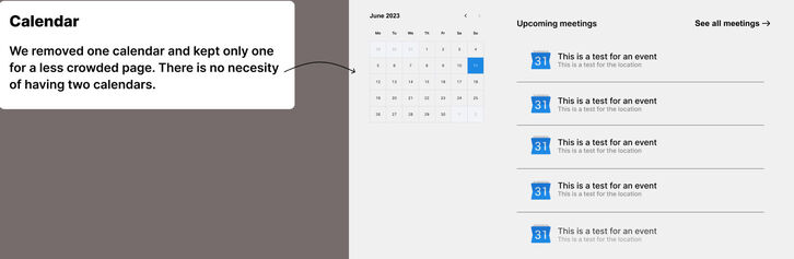
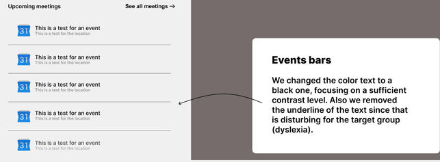
9. Clearer upcoming meetings section
Again to limit the amount of visible information, the design team decided to remove the other visible month from the upcoming meetings section, as most of the times showing only a single calendar should be enough.
Another change that was made was the color of the text to make it more readable and increase the color contrast. The underlines were also removed.
Again to be noted here that some of the design choices made here may not be in line with the WCAG criteria. The WCAG criteria should be considered with these design suggestions (i.e. make links distinguishable from the body text).
10. Search with voice / improving search
In order to make searching for content easier, the design team added a search with voice functionality in the search bar. Dyslectic people may have problems finding content because of misspellings, especially when using a second language.
As an extra note, I also wanted to add here that possibility for fixing spelling mistakes in the text search would also be helpful for this kind of problems. Such functionality is available in many search engines and it is based on behavioral data about what kind of words people usually spell incorrectly.
This should be considered as an additional feature, not something that is related to the design aspect itself.
Describe alternatives you've considered
As these are all design suggestions at this point, there are no alternatives considered. There are some further notes and design considerations that I have included with the presented improvement ideas.
Additional context
All thanks for this work goes to the design team at Hyper Island. These are all suggestions, so based on this work, the work can continue further in the future design iterations of Decidim.
Could this issue impact on users private data?
No
Funded by
N/A

QR Code

Design considerations for people with dyslexia
Liked by


Share
Or copy link