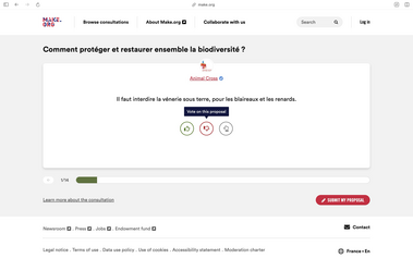
Voting carousel
Is your feature request related to a problem? Please describe.
The current voting process for proposals is quite complex. Users have to click on each proposal, read it, and then vote, which can be tiring and reduce participation.
Describe the solution you'd like
We propose an alternative, optional, simplified interface inspired by Make.org. This new interface would allow users to focus on one proposal at a time, making it easier to understand the content. It also encourages a diverse range of votes by exposing users to various proposals, not just the ones they already know or with catchy titles.
Here is a video to understand it better: https://youtu.be/4OHo1-sAUto
Describe alternatives you've considered
-
Additional context
If there are many proposals, they can be displayed in batches of 15 randomly to avoid decision fatigue. This will also improve performance by only loading 15 proposals at a time.
For specific voting rules like a minimum or maximum number of votes, the number of votes remaining will be displayed at the top of the card to guide the user.
Does this issue could impact on users private data?
No
Funded by
Possibly the European Commission, but that is TBC.


Share
Or copy link