Aquesta proposta ha estat acceptada per ser implementada al repositori principal. Segueix les actualitzacions als comentaris
We have received feedback during a usability testing session that people do not realize they can click on the second level navigation item to open the "accordion" navigation below it.
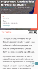
We suggest this would be emphasized by adding a clear indication that there is a menu available under that link. The following changes would be applied:
- Add a "Menu" term next to the icon indicating there is actually a menu
- Change the icon to something more visible indicating that it opens a menu below the element
- Add a border around the "Menu" term and its icon to indicate it is a button that can be clicked
A UI comp is attached to this proposal that shows the idea as a mockup. It does not show the visual implementation details, just the idea. However, this should be indicated with a different color in the UI than is used for the links in the menu ("The process" in the comp).
Li agrada a Pau Parals


Compartir
O copiar l'enllaç