Community Meeting 4: hierarchy of actions (Redesign Process)
March
30
2022
-
16:00 PM - 18:00 PM CEST
After a few weeks of work we invite you to a new meeting to update you on the progress of the redesign and address another of the most reported problems regarding the usability of Decidim: the number of buttons and actions that can be active at the same time.
This often creates confusion for participants, so we are working with different hypotheses for improvement. We have opened a debate to collect feedback prior to the community meeting, so that we can share it when we meet.
In addition to discussing the hierarchy of actions, we'll also present a mockup where you will be able to see in detail how some components, the process landing and the home page look like.
Check the prototype:
Structure of the meeting
1. Presentation [16:00 - 16:15]
2. Group work [16:15 - 17:00]
Discussions in groups of 8-5 people
3. Conclusions [17:00 - 17:15]
Meeting Minutes
WORK GROUPS
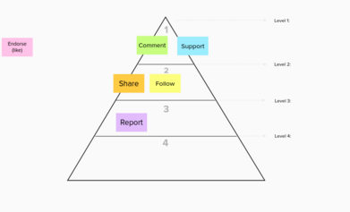
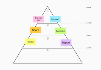
2.1/ Hierarchy of actions dynamic
Discuss with all the members of the group and decide how to order the actions according to the level of importance.
2.2/ Discussion questions:
Like, endorse or fav
- Which are your thoughts on the idea of a “like button” transversal to all components and content. For what purpose could this be useful?
- Instead of a “like button” would you prefer a “Fav button” to add content to a favorite content list?
- What other ideas do you have about like, endorse or fav?
Proposals navigation
- In the prototype, we’ve seen a new navigation system for proposals. The goal is to improve the navigation between proposals without losing context. What do you think about this proposals' navigator?
- Do you think it should be possible to support without reading the description of the proposal?
- What other ideas do you have about proposals and other contents navigation?
Grup 1)
Like, fav or endorse
- It should be configurable, but it's interesting.
- Maybe only showing the avatars that people you follow. Or show it first.
- Antti mentions the possibility of anonimize your personal profile.
Group 2)
Like, fav or endorse
- Endorsements are more engagers for users. What' I fond really hard in this matter is that depending on your Proposals component configuration, the actions that I want to highlight are different
- What is the path of engagement? First you endorse and next you want to share the content.
- From a UX perspective there’s no clear solution. Things I would consider from a UX perspective to Position these actions:
- How does it impact *engagement*?
- How does it impact *adoption*?
- How does it impact *retention*?
- I think endorse should be thought of as "reactions" and offer a few options like Facebook.upports should remain as they function, but could benefit from a little bit of generalizations and be changed to Vote or Sign, or the option to choose the text from a few choices like that.
Proposals navigator
- The less the better
- We have to encourage people to read in detail the proposals before voting, but without forcing them.
- We could subvert the design pattern used to read the T&C in apps everywhere.
- On Decidim it would look like:
- Browsing/comparing proposals easily in a reduced format
- Being able to click on support from this view
- To activate this support, having to review the whole proposal before clicking on "confirm”


Share
Or copy link